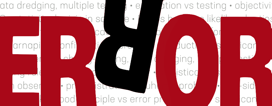
30 years ago today, Chicago Press sent me a draft version of this cover for Error and the Growth of Experimental Knowledge for my approval (except the fuchsia and mustard in “ERROR” were switched). At first I thought it was so cartoony that it might be an April 1 joke! I had sent them a picture I drew (now in the preface), but they didn’t think that worked for a cover. They were right. It’s a fabulous cover!

To access EGEK.


")


This is a fantastic book and one I just recently started to read again!
Indeed, I always liked that cover.
It’s funny how I thought at first it was too unserious for the serious book I had just written, but Chicago was right. Even the lettering–switching the mustard and fuschia as they had wanted–was, objectively speaking, better because it gave better contrast. I just wanted more fuschia, less mustard.
Interesting post, thanks for sharing this. It’s nice to hear the story behind the cover design.
gtu