

Graphing t-plots (This is my first experiment with blogging data plots, they have been blown up a bit, so hopefully they are now sufficiently readable).
Here are two plots (t-plots) of the observed data where yt is the population of the USA in millions, and xt our “secret” variable, to be revealed later on, both over time (1955-1989).
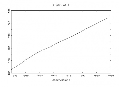
Fig 1: USA Population (y)

Fig. 2: Secret variable (x)
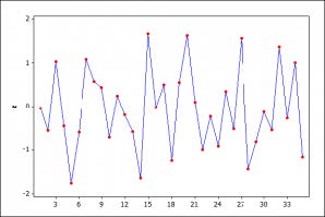
Figure 3: A typical realization of a NIID process.
Pretty clearly, there are glaring departures from IID when we compare a typical realization of a NIID process, in fig. 3, with the t-plots of the two series in figures 1-2. In particular, both data series show the mean is increasing with time – that is, strong mean-heterogeneity (trending mean).Our recommended next step would be to continue exploring the probabilistic structure of the data in figures 1 and 2 with a view toward thoroughly assessing the validity of the LRM assumptions [1]-[5] (table 1). But first let us take a quick look at the traditional approach for testing assumptions, focusing just on assumption [4] traditionally viewed as error non-autocorrelation: E(ut,us)=0 for t≠s, t,s=1,2,…,n. Continue reading


")

